Scheme of cold and warm colors. Warm and cold colors in airbrushing. The brighter the color, the more it fills
Sometimes people find it hard to say cold or warm shade of some color In front of them. Knowing everything about color temperature is important, as it will not only help us decide with own temperature of natural colors, but also in the future to choose clothes that are suitable for us, the colors of which will decorate us, make our faces fresher, more rested, and make us even more beautiful!
What you need to know about color
A typical color wheel consists of the six colors of the rainbow. Remember, "Every hunter wants to know..."? You say the rainbow has seven colors? Yes, but blue and cyan are essentially the same color (cyan is a light shade of blue), so the two colors are combined on the color wheel.
Between these six colors (red - orange - yellow - green - blue - violet) are intermediate colors that combine the qualities of their neighbors. Between red and orange is red-orange, between orange and yellow - yellow-orange, between yellow and green - yellow-green, between green and blue - the color of the sea wave (blue-green), between blue and purple - blue-violet, and between purple and red, red-violet.
One of them is color temperature, that is, colors are divided into warm and cold. It is common to divide the color wheel in half along the border between red and green (image below), but sometimes you can also see a division of the circle between yellow and purple. In any case, we subconsciously perceive all colors close to yellow as warm. All colors close to blue seem cold to us. Therefore, they are guidelines for the "warmth" or "coldness" of a color.

See for yourself: if you remove all the so-called cold colors on one side of the dividing line, then half color wheel we feel warm.

And if you remove all the warm colors, then the remaining half looks cold.

How do we understand which color is warm and which is cold? Subconsciously, all colors that either clearly contain yellow in the composition, or approach it on the color wheel, we perceive as warm.
Everything that reminds us of blue or is close to it seems cold to us.
Let's take three shades of red: scarlet, berry and crimson.

Scarlet seems to be the warmest of them, berry is already colder, and raspberry is perceived as cold.
Let's decompose the color wheel into large quantity shades, distributing them according to warmth relative to each other (warmer shades go in one direction from the center of the main color, colder ones in the other). For example, from pure yellow (the main color) towards orange there are more and more warm shades of it (yellow-orange), and towards green - more and more cold (yellow-green, that is, lemon).
Warmer shades (red with an admixture of orange, the neighboring color) go from the center of pure red towards yellow, and colder shades go towards purple (red with an admixture of violet), etc.

Let's find our scarlet, berry and crimson on this more detailed color wheel.
So we will see that scarlet is closer to yellow than the other two colors, and crimson is farther from all three of them, but closer to blue.

Therefore, scarlet seems warmer to us, and crimson - colder.
Thus, we subconsciously compare colors with yellow and blue. It is these two colors that are responsible for the warmth and coldness of each shade. Let's see why.
Tone and subtone
We just talked about the fact that the color wheel is divided into two halves, one of which contains warm colors and the other cold.And then we compare the shades of red, which seems to be warm, noting that some of them are colder than others. Why is it so?
The fact is that every color has a tone and a subtone.
Tone is the main color that is immediately visible (chroma, that is, chroma, the color itself), and the subtone is what makes the color warm or cold, that is, the color additive.
Each color (red, yellow, green, blue, etc. in the rainbow) has a great variety of shades. These shades are formed by mixing that color with another color (or colors). It is this other color that is the undertone.
If you add yellow to any color, it will make it warmer, and if you add blue, the color will become colder.
For example, take yellow. He is a priori perceived as warm (this is his tone), but it also has cold shades, lemon, for example. He is also yellow (warm tone), but he has cold shade (undertone- added blue to yellow). Adding blue makes any color (tone) colder, and adding yellow makes it warmer. If you add blue to yellow, then it becomes greenish (lemon), and this shade is already perceived as cold, because it has a cool (blue) undertone.
Let's look at the picture below.
Egg yolk color: yellow (warm tone) + yellow ( warm undertone) = warm shade of yellow.
Lemon color: yellow (warm tone) + blue ( cold undertone) = cold shade of yellow.
Green khaki: green (neutral tone) + yellow ( warm undertone) = warm shade of green.
Emerald green: green (neutral tone) + blue ( cold undertone) = cold shade of green.
Blue aqua: blue (cold tone) + yellow ( warm undertone), since the mixture of yellow and blue gives such a blue-greenish tint = warm shade of blue.
Azure blue: blue (cold tone) + blue ( cold undertone) = cold shade of blue.

What does warm and cold color mean
So, if you add yellow to any color, then the color acquires a warm tint.If you add blue to it, then the color becomes cold.
If we catch a yellow undertone, then we can say with confidence that this is a warm shade of any color.
For example, olive is perceived as a warm color, as yellow is clearly added to green here. There is a yellow (warm) undertone.
But bottle green is perceived as cold, because blue is added to green, and this is visible (it is a little bluish green color). There is a cool blue undertone.

Why you need to distinguish warm shades from cold
To distinguish warm shades from cold ones (some will be warmer, some colder), it is desirable that we be able to select the colors that suit us in clothes and cosmetics. If you have a pronounced temperature of the colors of your appearance, that is, you belong either to or to, this skill will be simply necessary for you. Often such people find themselves closed in a certain color palette, afraid to go beyond it. For example, people with cold colors know that warm colors absolutely do not suit them, and therefore they do not use yellow, green, often even red at all. But in fact, there are many cool shades of these colors, and they could perfectly suit their cold colors, and vice versa.Expand your possibilities, do not be afraid to experiment, add new colors to your life, let it be painted with a variety of wonderful colors!
For those who are painfully trying to determine whether his exterior colors are warm or cold, I have prepared a surprise: in the next article I will give VERY DETAILED recommendations, how finally determine your temperature.
Dear readers! Leave feedback and your wishes, ask questions, I will be happy to answer them, write what else you would like to read about and subscribe to the news.
Preview photo : colorpalettes.net
What is color temperature and what does it affect? The concept of warm and cold colors in color is different from the generally accepted in the study of the exact sciences, it defines not real physical properties, and its perception by a person, the impact on well-being and mood. Although this knowledge is subjective, it has been verified by many years of practice in areas such as art, design or color therapy. In addition to color temperature, stylists and makeup artists work with shade temperature. The temperature of color and shade are often confused, so we will analyze them separately.
Color temperature.
It has long been known about the psychological impact of color on humans and some animals, especially if large areas are painted. Therefore, it is important to distinguish between warm or cold colors when choosing color schemes interiors.
This experience is backed by research. It turned out that cold colors lower, and warm ones increase blood circulation. For example, the room was painted in a certain color and people were asked to determine the temperature. In rooms painted blue and green, people felt the temperature was 2-3 degrees lower than in a room painted red and orange. It is no coincidence that in everyday life the designations of cold in blue, hot in red on taps with water, thermometers, and other objects. These household designations further fix the temperature-color associations in the mind. Reinforce associations and natural phenomena. Sky, ice, water, have blue shades. The sun, fire, sand are orange.
How to determine warm or cold color?
Color temperature is easy to determine with . It is absolute and relative.
Absolute color temperature.
Divide the color wheel into two halves. At the top pole is the warmest color - orange. It is considered the warmest, because it does not have cold shades, later we will consider this property in more detail. At the lower pole is the coldest color - blue. On the sides of the color wheel are the temperature-neutral colors green and magenta. Both are formed by a mixture of cold and warm colors, green - yellow and blue, purple - red and blue. All the colors of the upper half are considered warm, and the lower half are considered cold.

Achromatic colors: white, black and gray are neutral.
relative temperature. Cold and warm shades of colors.
Understanding relative temperature is important when working with multiple colors and a color palette. It helps, for example, to convey space and volume in an image or surface using color.
In addition to orange and blue, all colors can be both warm and cold relative to others at the same time. Using the color wheel, this is as easy to determine as absolute temperature. Warmth decreases as it approaches the lower pole and blue, for example, red or yellow will be colder than orange, and lemon or magenta will be colder than red and yellow. The same principle works in increasing warmth: cyan and violet will be warmer than blue, turquoise and purple even warmer. Temperature gradations are especially evident in and palettes.
A color can be warm or cold not only in relation to other colors, but also to its own shades.
Cold and warm shades of colors.
With the determination of the temperature of the shade, difficulties most often arise. Such concepts as cold red or warm red have become firmly established in everyday life, but not everyone understands the same thing by them. First, relative hue temperature is often confused with color temperature. Secondly, subjectivity: there is no precise definition of where red begins and ends. Meanwhile, the ability to determine cold and warm tones is important when working with a person's appearance, for example, determining color types and selecting individual color palettes. This skill can be developed through experience and understanding of a simple principle.
Any color other than orange can have warm, neutral, or cool undertones. How to determine the temperature of a hue using the color wheel?
We take any color and define its boundaries. Then we find the approximate center. Shades of color lying on the side of orange will be warm. From the blue side - cold. Intermediate colors without impurities of warm or cold are called local or neutral.
Let's start with green. It is formed by warm yellow and cold blue colors. Cold or warm green tint is obtained due to the predominance of blue or yellow. Moving up to yellow, we get warm shades, down to blue - cold.


The same principle applies to other colors, such as yellow. Approaching orange, the color warms up. Going down, yellow acquires a greenish, lemony, cold hue. Neutral yellow does not have a clear greenish or orange cast.


The orange color stands out in particular. This is the warmest and only color that does not have cold undertones. In addition, it spreads warmth to the surroundings. The nearest colors: yellow-orange and orange-red are also exceptionally warm.

Red. The same principle applies here: the upper shades, highlighted by yellow, are warm, the lower ones from the purple side are cold.


Purple itself is neutral, like green, it is formed by a mixture of cold and warm colors. A large proportion of red makes it warm, blue - cold. From the point of view of use in warm or cold scales, this is a rather complex color. The differences between warm purple and cool red or cool purple and violet are difficult to distinguish. It is also difficult to isolate the local magenta color.


The same boundary difficulties apply to purple. When adding red, it warms up, blue - it gets colder.


The difficulty in determining the temperature of a shade is that there are no exact and generally accepted distinctions where the warm shade of one color ends and the cold shade of another begins. There are no clear boundaries and local shades. Usually, when we are dealing with primary colors: red, blue, yellow and green, this division is intuitive, experience helps to distinguish between other colors.
The blue color is the coldest of the entire palette, it is the opposite of orange. But if orange makes neighboring colors exceptionally warm and does not have cold shades, then blue does not have similar properties. It is conditionally possible to distinguish warm blue color. Some people think that blue, by definition, cannot be warm, but a warm range of colors can contain blue, if you choose its right shade. Its cold, they are local shades are located in the middle, and warm at the edges: on the one hand, blue is highlighted with yellow, on the other with red. These shades will be warmer relative to cold blue.


Blue-green colors stand out separately. Here, warmth-coldness is conditional and depends on whether they are singled out in a separate group with their own local color or considered as part of green and blue shades.


So, we come to the influence of lightness and saturation on the color temperature. Up to this point, we have considered the properties of warmth-coldness on pure colors and one parameter - tone. But this is not enough, since most often you have to deal with complex colors in which there is an admixture of achromatic, that is, take into account all three parameters. Lightness changes with the addition of white and black, saturation - with the addition of gray.
Temperature of achromatic colors.
Pure are neutral. However, in nature it is difficult to find absolutely neutral gray, white or black, they always have an advantage in one direction. So, cold or warm white color is obtained from the admixture of other tones. Yellow-red make it warm, blue make it cold. The same applies to gray and black.

The temperature of the mixed colors.
For clarity, it will be convenient here to return to and look at its vertical slice. Along the edges are the cold and warm poles of the color wheel, in the center are neutral colors. Moving from the extreme temperature characteristics to the middle, the color approaches the opposite pole and is thereby neutralized. In other words, as saturation decreases, lightness increases or decreases, the color will mix with neutral achromats and become neutral itself.
 Warm group - reds, yellows become less warm, their diluted shades seem colder.

Dilution with gray and black most quickly changes the character of light yellow and lemon shades, they seem greenish and cold.

Orange color does not acquire cold shades, but becomes more neutral. With dilution, it quickly ceases to be recognizable and turns into brown.

Blues and purples with the addition of white and gray lose their cold properties and seem warmer.

As you can see, with the help of the color wheel it is easy to distinguish cold shades from warm ones. Difficulties arise with the definition of blue-red and blue-green shades, it all depends on which color is considered local. Complex and mixed colors are more difficult than pure colors in determining warmth-coldness. Here it is necessary to distinguish nuances and see how the same tone changes along with lightness and saturation.
When creating an airbrush drawing on a car or when painting interiors, a professional artist will definitely take into account the "temperature" property of color. Warm and cold colors in their combination make it possible to convey many emotions in one composition. A hot battle, the battle of heroes is a combination of the coldness of weapons and the heat of fire and smoke; the burning, hot sand of the desert and the cold mirage of the oasis with the so desired cool water will convey all the emotions of a traveler dying of thirst.
What does color have to do with temperature? Why "warm" or "cold" shade? Of course, by touching a red image with a finger, we will not get a burn, and standing next to a “cold” picture, we will not catch a runny nose. The division into warm and cold colors is associated with an associative representation. The colors that make you think about fire, sun, heat, summer are considered warm. And cold shades will make you associate with cold, ice, winter, depth.

Warm colors are colors that include red, yellow, or orange. Cold blue when adding a drop of orange becomes much warmer.


Cool colors are colors with a blue tint. Add a little blue to the yellow color of the scarf, and the warm scarf will no longer seem so warm and soft.


Any color can be both warm and cold. It's all about the shades. For example, yellow "increases" the temperature of green, and blue color, on the contrary, "lowers". Sometimes only by comparing two shades, you can tell which of the shades is colder and which is warmer.

For example, a Golden hue will be cooler than Saffron, but warmer than Lemon.
The only color that under no circumstances does not change its temperature is orange, no matter how much you “cool” it.
Warm and cold colors are often used by artists to create perspective. Visually, objects in warm colors appear closer, while objects painted in cold colors fade into the background. This perspective is called light perspective.
Artists use the thermal properties of color in airbrushing interiors. Warm colors visually reduce the space. At the same time, they make the room more cozy and comfortable. Cold colors, on the contrary, push the space apart, create a sense of depth, help to focus and gather. The combination of cold and warm colors is effectively used when you need to adjust the geometry of the room, visually reducing or increasing the space.
Everyone knows that black visually makes the figure slimmer, and white makes it fatter. But your color scheme in clothes is not limited to these colors. Other colors also have visual deception properties. Let's analyze by what laws and principles we see something that is not actually there, in order to make this effect work for ourselves.
1 Light appears larger than dark.
The apogee of this statement, just the same, is black and white. This visual trick is related to the ability of a colored object to reflect or absorb light rays.
Things white color reflect the maximum number of light waves that diverge in different directions. As a result, the boundary between white and another color is blurred, making objects appear larger than they really are.
Black color absorbs light rays, so its borders appear clearer than a white object, and, therefore, it will look smaller than it really is.
Gray color reflects light rays half as much as white, and the same number of times more than black. Its borders are not as pronounced as in black, not as blurred as in white, but at the same time it loses contrast with the environment. Therefore, this color will slim during the day (not like black, but still) and full in the late evening or at night.


Each color has dark, light and medium shades. They, too, obey the laws of greater or lesser reflection. Light shades of any color will increase dimensions in relation to dark shades. 

The expanding and contracting effect is useful for masking figure flaws.
Women who seem to be fuller than they would like, it is better to use dark or medium colors.
For thin people, light and medium are more suitable.
In addition, you can mask slightly plump parts of the figure and unnecessarily thin ones by combining dark and light, while remaining in the same range.
2 Shiny fabrics, even dark ones, are full
It is logical to assume that the mirror surface reflects light much more than a white canvas. A halo of light draws a couple of centimeters for you. 
Therefore, if you want to look slimmer, then do not choose black. sparkly dress. Black, in this case, does not compensate for its brilliance. If you fundamentally like glitter, use it in accessories.
But for thin, shiny fabrics are a great help for correction.
And if you have a figure resembling a pear, then a shiny top will suit you.
3 Cold shades slim more than warm ones
Yellow, red, orange. They selectively reflect waves in their short range. You can’t say about them as about white - it reflects light waves of all sizes ( see the physics of color) But these colors are also able to expand objects.
Blue green, blue, purple. Besides the fact that these colors are darker at their highest brightness than the brightest warm colors, even when diluted with white, they give less expansion effect than warm colors. This means that a light blue color will be less full than a light warm pink. 

So, if you have a choice between warm dark and cold dark, with the main requirement of hiding excess weight then choose a cool shade.
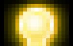
4 The brighter the color, the more it fills.
Intense shades blind the eye, and this effect causes blurring of the boundaries. Even bright blue: cold and not light, will make you wider than gray-blue of the same lightness. 

Let's summarize
According to the given data, it turns out that for overweight people, dark, not bright, cold colors will be ideal. It's like in food: everything that is not tasty is healthy. But I don't think we should go to such extremes.
It is worth knowing that vertical stripes, whatever the color, are slimming, even if it is a peeking blouse from under a cardigan.
And dark things should always be diluted with bright accessories.
I suggest the following combinations for your consideration:
Color combination for overweight people
black blue color
Alternative to black: deep black-blue color. This color is already different from achromatic: it is more fresh, rich, piquant. Suitable for both office and banquet. Combine it with light juicy colors.
Such as purple, burgundy, gold, green, calm azure, brown, lilac, medium beige. 
Malachite color
Rich, luxurious, exotic color - the perfect solution for full figure. Your forms in it will become appetizing and attractive. Malachite universal: everyday and festive color, combined with the color of pink orchid, raspberry, sand, pale green, aqua, coffee with milk, light lilac, and light beige. 
Cherry color
Feminine and erotic. Soft and exciting. He will not leave anyone indifferent. Conquer hearts, showing all your feminine nature. Your round shapes in this color will become a virtue.
Cherry color is combined with lilac, raspberry, camel, green blue, gray blue, royal blue, lilac, light brown. 
Let's not forget about slender girls who could add a couple of kilograms. Fortunately, they have a choice.
First: these are light warm shades, combine them with bright accessories, add shine.
Second: use shiny fabrics: patent leather, materials with sequins, satin, fabrics with lurix.
Third: bright light clothes.
Color combination for thin people
Silver peony or beige pink.
This color is proposed by Panton as one of the fashion leaders for the spring-summer 2011 season. Delicate, mysterious, filled with the inner strength of a blooming flower. It is more intended for leisure than for the office, although it will not be against everyday wear.
Beige pink is combined with warm pink, orange red, orange sorbet, fresh green, aquamarine, denim blue, coffee with milk, bright lilac, light gray colors.

Light gray green
Restrained, sophisticated. Looks good on satin fabrics. It is designed for the office, as well as for a holiday or recreation. Combine it with glitter, you will look like a rare tropical fish that accidentally got into a gray city.
Grey-green combines with megento pink, red, yellow-orange, olive, blue-green, old gold, pink purple, pale gold.

fuchsia color
Bright, fast, bold. He is always distinguished from the crowd. Fuchsia does not irritate the eyes, and is perfect for working days, but at the holiday it will be a special pearl.
Combine fuchsia with soft pink, bright pink, light yellow, light green, light blue, blue, coffee with milk, bright lilac, gray flowers.

Illusion of clothes pattern.

In the article " which color is fattening and which is slimming» we got acquainted with the optical illusion of color. But this is only the simplest of its manifestations. More complex, varied, bizarre, giving a huge amount of material for experiments and figure adjustments - this is a drawing. And what is a drawing if not a combination of colors in different form? The combinations are bright, contrasting, gradient, barely noticeable in a certain sequence. Some can make even light shades slim, while others can make dark ones, but they deceive in a big way. There are so many drawings that it seems impossible to sort through their illusory effects. But we will try anyway.
First, I want you to look at the girl in different clothes. She loves patterned dresses. By European standards, she cannot be called thin, so the optical illusion of the fabric pattern on her is more noticeable.
Drawings on fabric


Striped dresses
1) horizontal stripe

The fashion for horizontal stripes is quite stable, perhaps because the ideal skinny women never left the pedestal, although this causes indignation among the sane part of the population.
Horizontal stripe - full. It looks perfect on a slim figure. It can visually expand parts of the body that you think are thin or disproportionately small. For example, not big shoulders or small breasts, etc.
We have to give credit: the horizontal stripe is attractive. Her charm is that she contrasts with the vertical features of the body: arms, legs, due to this, stripes, legs, and graceful hands attract attention.
The more contrast the stripes, the more expression the effect, so black and white stripes equal to each other will be extreme in their kind - they will expand to the maximum.
The thinner the stripes, the more the visual illusion of the wide colors appears. If they are white stripes, then the expansion effect will remain. If they are dark, and thin ones are not contrasts, then the picture will be slimmer.
Slightly contrasting, different in width stripes on a cold, not bright shade may not manifest themselves in any way.

2) vertical stripe

This drawing is slimming. The lines follow the structure of the body. The amount of its border, in the form of a line, becomes larger. The eye fixes the boundaries convenient for it, which closer friend to a friend than actually. It's like looking at eye level. Therefore, any presence of such lines, even a scarf, makes you slimmer.
Even if you have a light dress with beige vertical stripes, this effect will work.
If the stripes are bright, against the same background, then deception can be reduced to zero.
A vertically organized pattern, even on light-colored fabrics, will help you look slimmer.
Another one from interesting properties vertical stripe: against this background, the wrinkling of the fabric is not visible.

3) oblique lines
They bring dynamism to clothing, taking the eye away from the edges of the figure. This is not to say that oblique lines are slimming, we can say that they are distracting. Therefore, they are suitable for girls with any figure.
Be careful: oblique stripes that are too contrasting can distract attention to themselves so much that people do not remember your face.
Soft contrasting light oblique stripes will fit well into any wardrobe.

4) Cell drawing

This drawing is complete. And the larger the cell, the warmer the shade and the richer the color, the more the space moves apart. But how attractive it is, how beautifully colors can intertwine in it!
To negate this effect, you should stick to dark shades of fabric with barely visible stripes, preferably thin ones.
You can also choose a pattern with pronounced vertical lines and thinner horizontal ones.
The presence of a hanging scarf, an unbuttoned coat or sweater will also visually limit the expansion.
But for slender and thin - this is a great way out.

Floral drawing
5) Medium sized flowers

Beautiful, bright, colorful dresses. What can decorate a woman better than spring. However, they are also visually full. Another plus for the wardrobe of slender girls.
But if you look closely, then light dresses with a very frequent light pattern make you fat more than dark ones with a rare pattern. And the presence of an unbuttoned blouse, coat, scarf will add those very vertical stripes that work wonders.
I note that a medium-sized drawing should not be worn by fragile girls, against its background they will be emphasized small.


6) Big flowers

Usually bright spots - large flowers "push forward" and, of course, make them fat, but at the same time they also distort the proportions of the figure. Distortion can be very skillful when flaws become virtues. And it can ruin the whole image.
This coloring is suitable for large women if they have disproportionately small places in the figure (chest, shoulders, hips, etc.). It is desirable that the flower lays down there. If the drawing is in full place, then it will bulge grotesquely.
A special effect is obtained in a combination of a bright flower and dark fabric.

7) Small flower

A small flower expands, but in this case, much will depend on the overall shade of the material. Light and bright will fill you up considerably. The same will happen if the picture is strongly contrasting. Dark, cold shades of fabric with a soft pattern will not make significant changes to your figure.
Large and fat girls this pattern is not desirable, as it will emphasize massiveness.

Illusion of clothes pattern. Part two

This article is a continuation first part, where we have already examined some of the patterns on the fabric and their features. I repeat: there are a lot of drawings and they all distort your figure in one way or another. The question is how to make each effect work for itself. So that he, in no case, spoils the figure, but on the contrary, makes it even more attractive. And all this is really possible, knowing the features and laws of the optical illusion of the picture.
Starting to study the pattern of clothes, you should familiarize yourself with more simple action of color, which plays a huge role in the distortion of forms, and in the article we will resort to this knowledge more than once.
Remember, beauty is knowledge and its practical application. And increasing them with each new “drop”, you strive for perfect, inimitable femininity, which has been worshiped for many centuries by both men and women.
Clothes drawings
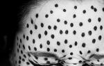
This pattern stands at a distance from seasonal fashion, its changeability does not affect its popularity. Polka dots are as classic as black, white or gray. Dresses with polka dots can always be found on sale at any time of the year.
The variety of colors in polka dots is also amazing: some visually expand very much, others, on the contrary, slim, there are even those that practically do not distort the figure. What does it depend on?
Visually increase:

1) Dark peas on a white background.
2) Frequent small peas on a light background
3) Very large peas
4) White polka dots on a bright warm fabric (for example, white polka dots on red, yellow or orange fabric)
5) Shiny peas

Slightly change the figure:

1) Dark polka dots on light fabric arranged vertically
2) Frequent white peas on a black background
3) Medium infrequent peas on a medium-light color of a cold shade (for example, white peas against a background of aquamarine)
4) Dark peas on a color of medium lightness.

Visually narrow:

1) Vertically organized light small peas on a dark background
2) Rare, closer to small, white peas on a black background
3) Rare medium peas of light shades, but not white (it is important that there is less contrast) on a non-bright background of a medium or dark shade, preferably a cold color (for example, yellow-orange peas on a denim background)
4) Dark peas, on a dark background


When a hue fades into a lighter, brighter or completely different color. This is how volume, richness of colors, and ... modeling of the figure is achieved.
Dim, cold, more dark colors visually reduce the volume. Bright, light, warm shades - expand. Make sure that narrowing shades fall into places that are fuller than you would like, and filling colors into thin areas.
So, for example, for women with a wide top and a narrow bottom, dresses with a gradient from a light top to a dark bottom are contraindicated.


A corner is nothing more than two oblique lines converging at one point. How do you remember from first part, oblique lines do not distort the figure, but distract from it. It's all thanks to the introduction of dynamics. And since the two lines tend to reunite, reducing the distance between them, their priority will be the narrowing effect. They do not just slim, but make the eye constantly run from the beginning of the triangle to its end, which can distract from studying the figure.
The sharper and longer the angle, the more it slims.
For the visual illusion of reduction, the horizontal or vertical location of the corner does not matter. They do not form new borders (like, for example, a vertical strip), but hide the volume of the figure.
A large obtuse angle, throws off the dynamics and can even fill you up.
A frequent, obtuse, contrasting or colorful angle can also give volume, rather than reduce it.


Classic leopard dress in shallow, oblong, dark brown spot on a light brown background. The specks are arranged vertically, and there are lighter and darker vertical stripes on the background. Most often, the contrast between the spots and the background is not great.
We can say with confidence: the leopard color of the dress is slimming.
The pronounced effect will vary depending on the size of the spots and their contrast with the background. A larger or contrasting pattern will slim you less.
Tiger dresses also have the effect of reducing the volume, since the stripes of the tiger are more like a long sharp corner, and we examined it above.

Contrasting large pattern

By contrast, we mean a big difference between the properties of a color. So the highest contrast between light and dark is black and white. This is a very bright and restrained combination, but very dangerous in the distortion of the figure.
First, no more white or dark on the opposite background attracts attention, so both successful and unsuccessful corrections will be visible.
It is worth knowing that white lace or a frequent ornament on a dark background greatly expands the space. If the white pattern is placed horizontally along the edge of the dress, its hem appears to be wider than it really is. For women with wide hips or legs, this will betray an even greater increase in volume.
A vertically positioned white pattern, framed by a black background, makes the figure slimmer.
The location of the openwork pattern on the sides - increases the volume.
Black lace on white expands less than white on black, but it makes it look fat compared to plain black.

Abstract dress pattern
Drawing limited spots

Small spots limited in area with a clear contour, organized vertically - slim.
If the background is light, the picture is warm and large enough, then an expansion effect is observed.
Fills and very contrasting closer to the large pattern of spots.
But in any case, this drawing has more to do with the narrowing of the figure than the blurry one, since clearly defined spots, in turn, make it possible to more clearly draw the contours of the figure.

Blurry spots pattern

Let's practice finding and memorizing the leading color characteristic using specific examples. If light from dark or bright from muted is easily distinguished, then determining the color temperature is a more difficult task.
Think of blue and cyan as warm colors, and red and yellow as cool colors. The two meanings of the terms "warm color" and "cold color" are written. I remind you that a warm color is a color with a yellow (golden) undertone, a cold color is with a blue undertone.
Let's look at examples of warm and cold shades of basic colors.
RED.
warm shades red:
tomato, brick, coral, poppy red, copper red, fiery red, red fish color, chili pepper color, pomegranate, crimson, mahogany.
Cool shades of red: cherry, raspberry, cranberry, wine, burgundy, ruby, purple, burgundy, beet, cherry.
There are also neutral shades of red: scarlet, blood red, watermelon, cardinal.
There are others, but let's focus on these and try to learn how to see the color temperature.
Remember - warm shades gradually turn into orange (red + yellow \u003d orange), cold ones - into purple (red + blue \u003d purple).
Warm shades of red


Cool shades of red


YELLOW.
Clean yellow refers to warm colors. It “raises” its temperature even more when red is added to it. You can “cool down” the yellow color by adding blue and blue colors to it.
Remember the differences by association: a warm shade for the peel of a ripe banana, a cold shade for a lemon. But the color of the banana pulp is a neutral light shade, neither warm nor cold.

Warm
shades of yellow: golden honey, sulfur yellow, dandelion, mustard, chicken, amber, sunflower, mango, sea buckthorn, curry, turmeric, egg yolk, mimosa.
Cold shades of yellow: lemon, moon, straw, metal.
And others.
Remember - warm shades gradually turn into orange (yellow + red = orange), cold ones - into green (yellow + blue = green).

Warm shades of yellow


Cold shades of yellow


GREEN.
Green is obtained by mixing yellow and blue flowers. If these colors are in equal or approximately equal proportions, then in itself such green is neutral in temperature. If yellow color prevails, then the shade of green is warm. If blue prevails, then the shade of green is cold.
Warm shades of green: Maygreen, Olive, Polka Dot, Swamp Green, Linden, Cane, Khaki, Apple Green, Moss Green.
Cold shades of green: coniferous green, mint, emerald, jade, malachite, smoky grey-green.
And others.
Remember - cold green is gradually approaching blue-green, or the color of the sea wave. Warm shades approach yellow-green.


Warm shades of green


Cool shades of green


BLUE.
Pure blue itself is a cool color. Bright and especially dark shades of blue have a pronounced cold temperature. Such cold shades look icy.